Screenshot Any Page on Any Device — One Parameter
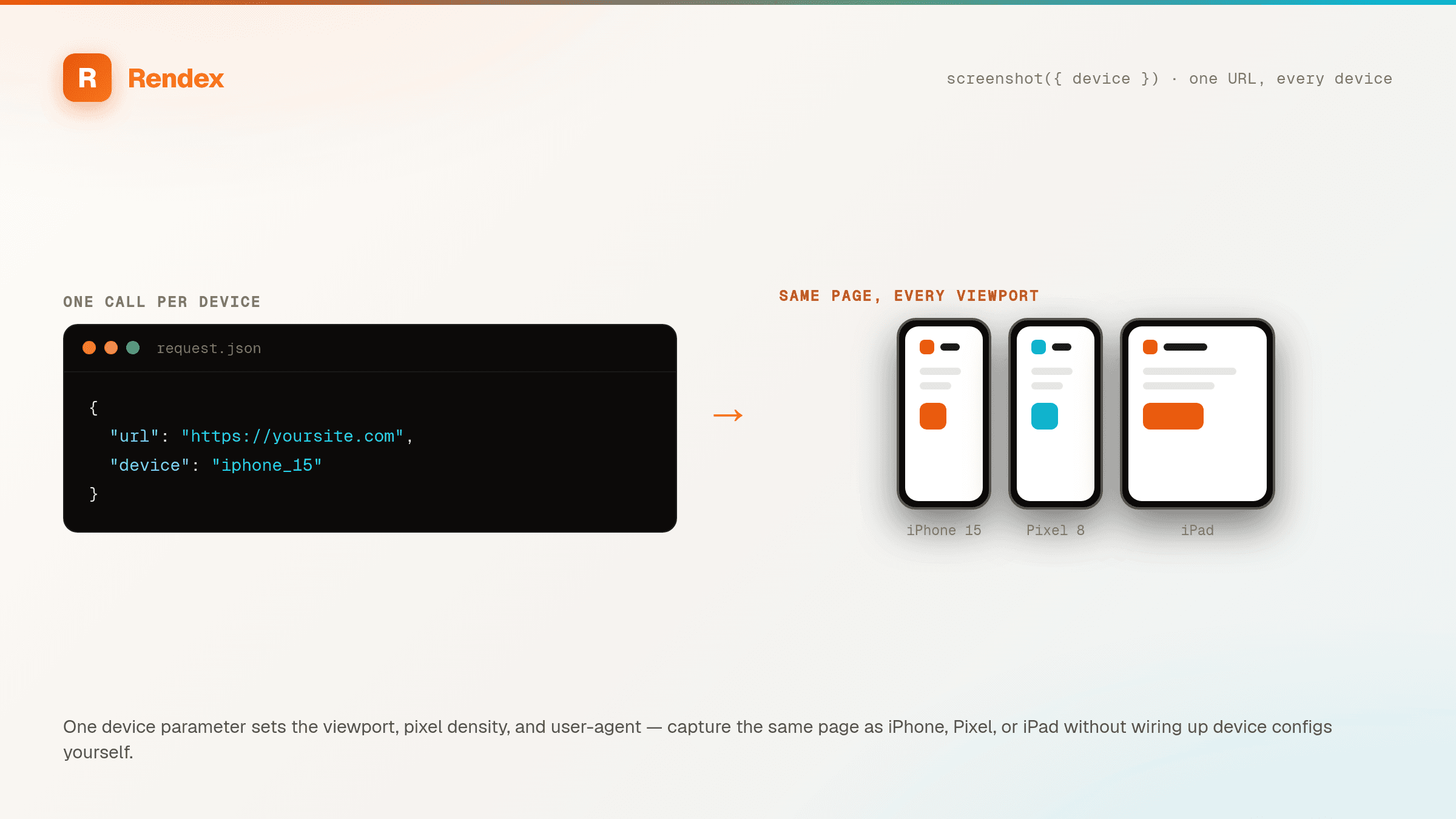
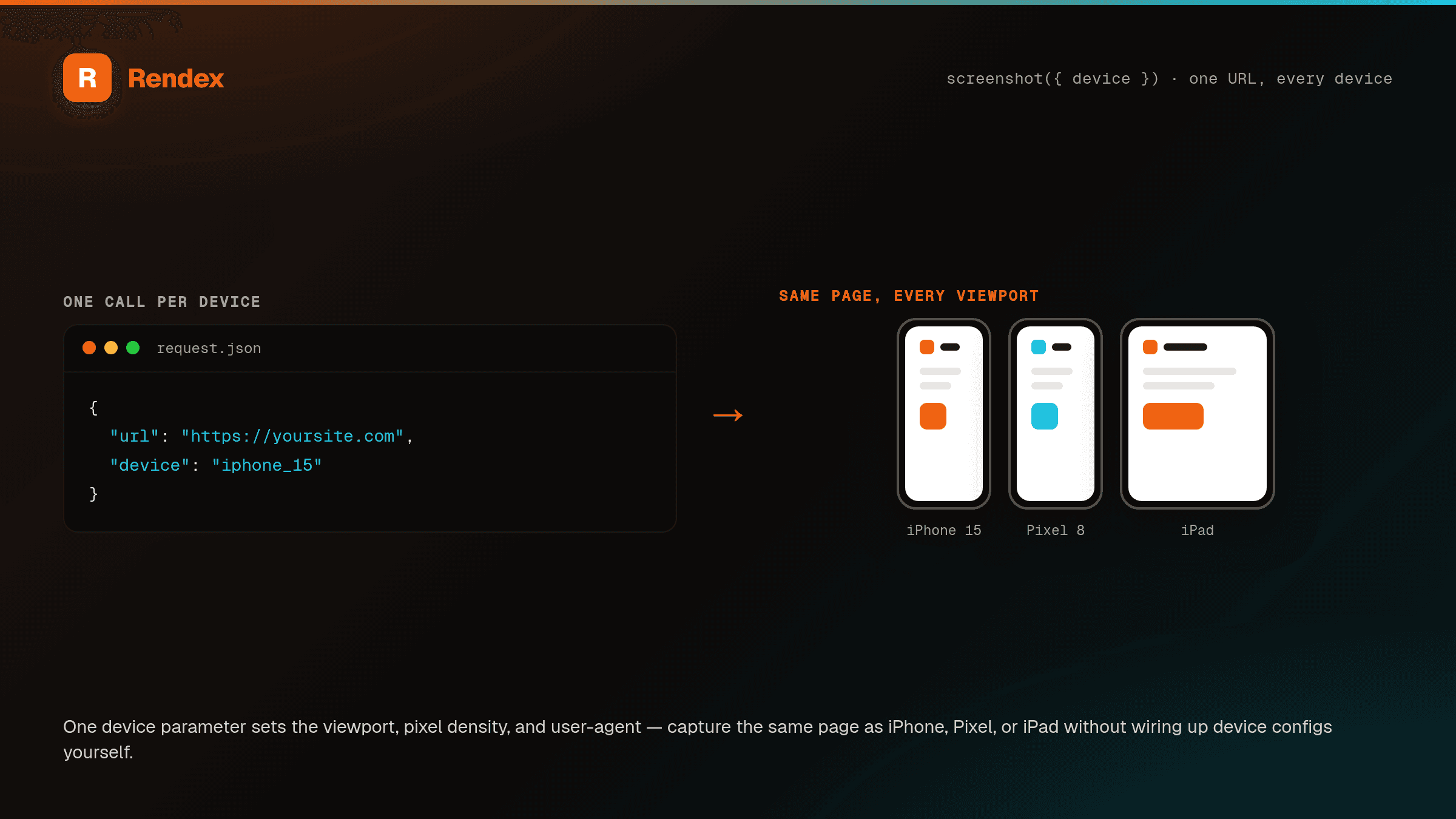
Set device: "iphone_15" and Rendex renders at that device's exact viewport, pixel density, and user-agent. Capture desktop, iPhone, Pixel, and iPad in one pass for responsive QA and mobile previews — no device lab, no hand-tuned browser descriptors.
The Problem
Verifying a page on mobile usually means juggling browser device descriptors, hand-tuning viewport widths and devicePixelRatio, and spoofing user-agents one device at a time. Getting the iPhone vs. Pixel vs. iPad combination right — and keeping it accurate as new devices ship — is fiddly, and a wrong pixel ratio gives you blurry or mis-scaled captures.
The Solution
Rendex ships curated device presets. Pass a single device value — desktop, iphone_15, iphone_se, pixel_8, ipad, or ipad_pro — and the API sets the viewport, deviceScaleFactor, and user-agent to match the real device. Loop the same URL over several presets to build a responsive QA set, or feed a preset capture into a device-frame mockup. Explicit width, height, or userAgent still win when you need a custom size.
See it in action
Get Started in Minutes
# Build a responsive preview set across device presets (GET → great for <img>)
for d in desktop iphone_15 ipad pixel_8; do
  curl -s -H "Authorization: Bearer YOUR_API_KEY" \
    "https://api.rendex.dev/v1/screenshot?url=https://example.com&device=$d" \
    -o "preview-$d.png"
donefrom rendex import Rendex
rendex = Rendex("YOUR_API_KEY")
# One responsive QA pass across real device presets.
for device in ["desktop", "iphone_15", "ipad", "pixel_8"]:
shot = rendex.screenshot(url="https://example.com", device=device)
with open("preview-" + device + ".png", "wb") as f:
f.write(shot.image)import Rendex from "@copperline/rendex";
import { writeFileSync } from "fs";
const rendex = new Rendex("YOUR_API_KEY");
// Capture the same URL on every device your users are on.
for (const device of ["desktop", "iphone_15", "ipad", "pixel_8"]) {
const shot = await rendex.screenshot({ url: "https://example.com", device });
writeFileSync("preview-" + device + ".png", shot.image);
}100 free API calls/month — no credit card required. Get your API key and start building.
Built for This Use Case
Six Real Device Presets
desktop, iphone_15, iphone_se, pixel_8, ipad, and ipad_pro — each sets the matching viewport, pixel density, and user-agent in a single device field.
Accurate Viewport & Scale
Every preset uses the device's true CSS viewport and deviceScaleFactor, so mobile captures come back crisp and correctly sized — not a desktop page squeezed narrow.
Responsive QA in One Loop
Run the same URL across presets to catch layout breaks before release. Pairs with batch rendering to check hundreds of pages on every device at once.
Override When You Need To
Need a size no preset covers? Pass explicit width, height, or userAgent and those win over the preset — presets are a fast default, not a cage.
Device-Frame Mockups
Feed a mobile-preset capture straight into a phone or tablet frame for landing pages, app store shots, and marketing mockups — no manual resizing.
Free on Every Plan
Device presets are available on every plan, including Free. No add-on, no tier gate — just one parameter on the same render call.
Start Free, Scale as You Grow
100 calls/month free. Starter at $69/mo for 10K calls (or $58/mo billed annually — 2 months free). Pro at $179/mo for 100K calls.